|
New banner
|
|
| Hana | Date: Sunday, 2008-11-23, 4:23 AM | Message # 1 |
 Head Mod
Group: Head Moderator
Messages: 374
Status: Offline
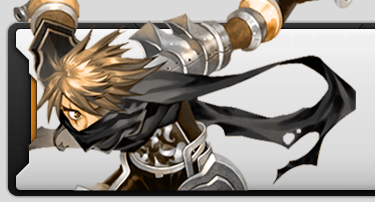
|  your comments are welcome .
not my best work To dex : If you find this doesnt fit the layout just pm me and ill make another Edit : Second version to it, 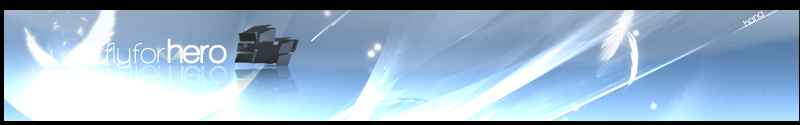
IGN : Hana, Senna, Liane. HGM of FlyFH. Proud Clan Master of whatever.
|
| |
|
|
| Milkdudboy | Date: Sunday, 2008-11-23, 7:36 AM | Message # 2 |
 Level 1
Group: Fly For Hero Player
Messages: 35
Status: Offline
| OMG it would take me probally like 3 years just to make xD good job Hana <3

Thanks Ritz for the sig xD
|
| |
|
|
| Alucard | Date: Sunday, 2008-11-23, 12:10 PM | Message # 3 |
 Level 10
Group: Fly For Hero Player
Messages: 69
Status: Offline
| thats mad, my best work is my sig i use now lol
If Life Gives You Lemons, Squeeze Them In People's Eyes... IGN: ProStyle
Level: 96 Billposter
Clan: whatever 
|
| |
|
|
| honer | Date: Monday, 2008-11-24, 4:40 AM | Message # 4 |
 Level 1
Group: whatever Member
Messages: 33
Status: Offline
| loL, hana what program do you use?
Death comes only once, live life till you die IGN: LustFUllUv
Level 118 BP
Clan: Creative +rep me please.
|
| |
|
|
| Hana | Date: Monday, 2008-11-24, 7:30 AM | Message # 5 |
|
Head Mod
Group: Head Moderator
Messages: 374
Status: Offline
| adobe photoshop
IGN : Hana, Senna, Liane. HGM of FlyFH. Proud Clan Master of whatever.
|
| |
|
|
| honer | Date: Monday, 2008-11-24, 8:24 AM | Message # 6 |
|
Level 1
Group: whatever Member
Messages: 33
Status: Offline
| damn, can't afford that
Death comes only once, live life till you die IGN: LustFUllUv
Level 118 BP
Clan: Creative +rep me please.
|
| |
|
|
| jonash | Date: Monday, 2008-11-24, 9:36 AM | Message # 7 |
 Level 10
Group: Fly For Hero Player
Messages: 99
Status: Offline
| I like this Header not.
It is no good work because there is no flow, you see a explosion and a litle figure and nothing more
And Flyforhero is hard to read .Back ground is boring too .
But I know that you are such better ^-^
next time you make a beautifull header =D
 (\_/) IGN : Louise, [BunnyGirl]Shana, Sayla
(^.^)Hero Billposter, 88-M YoyoJester, Hero Blade
(> <)Proud Guild Master of HelloKitty
Message edited by jonash - Monday, 2008-11-24, 9:38 AM |
| |
|
|
| Hana | Date: Monday, 2008-11-24, 11:57 AM | Message # 8 |
|
Head Mod
Group: Head Moderator
Messages: 374
Status: Offline
| Quote (jonash) I like this Header not.
It is no good work because there is no flow, you see a explosion and a litle figure and nothing more
And Flyforhero is hard to read .Back ground is boring too .
But I know that you are such better ^-^
next time you make a beautifull header =D Thanks for comments, im trying to blend the banner into the new website layout and since the background of the new site is bland blue abstract brushing wouldnt work well . I've thought of using vector but i don't think that would fit it as well . I've made a second version to the banner, a clean and smooth one .' And its true that the first one has no flow .
IGN : Hana, Senna, Liane. HGM of FlyFH. Proud Clan Master of whatever.
|
| |
|
|
| jonash | Date: Monday, 2008-11-24, 11:16 PM | Message # 9 |
|
Level 10
Group: Fly For Hero Player
Messages: 99
Status: Offline
| The second is much better =D
i like it ^-^
(\_/) IGN : Louise, [BunnyGirl]Shana, Sayla
(^.^)Hero Billposter, 88-M YoyoJester, Hero Blade
(> <)Proud Guild Master of HelloKitty
|
| |
|
|
| kennyben | Date: Sunday, 2008-11-30, 1:19 PM | Message # 10 |
 Level 5
Group: Fly For Hero Player
Messages: 72
Status: Offline
| all of your sigs are great. ..'cause i dont know how to make one.  

|
| |
|
|