|
my creation collection...
|
|
| MorningBreeze | Date: Saturday, 2009-06-13, 1:49 PM | Message # 16 |
 Level 15
Group: Blocked
Messages: 132
Status: Offline
| I really like the third one. The problem with the first too are that you get blinded by the brightness and colorfulness. *still loling @ your PM* Since you say those were your first ones, its nice overall ^^ *likes the 3rd a lot*

|
| |
|
|
| gothica | Date: Saturday, 2009-06-13, 3:54 PM | Message # 17 |
 Level 15
Group: Fly For Hero Player
Messages: 107
Status: Offline
| lol u love me really  dont lieeesss dont lieeesss n ty 

|
| |
|
|
| MorningBreeze | Date: Saturday, 2009-06-13, 4:12 PM | Message # 18 |
|
Level 15
Group: Blocked
Messages: 132
Status: Offline
| 
|
| |
|
|
| Ailyn | Date: Saturday, 2009-06-13, 4:17 PM | Message # 19 |
 Level 15
Group: Fly For Hero Player
Messages: 124
Status: Offline
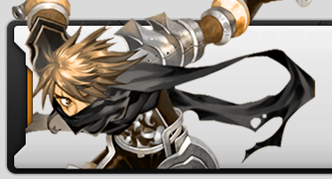
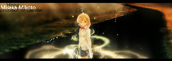
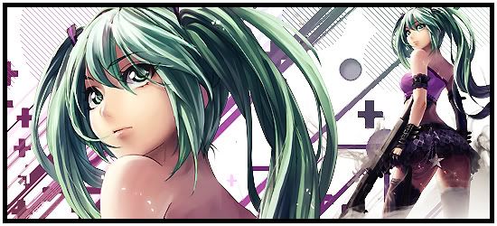
| 1) Dont like it. The font isn't good, the background kinda fits the render but at the same times makes your eyes drop ._. 2) The idea is well done. The font is ok since its the Kingdom heart's font, but the color isn't good, doesn't fit the rest of the sig, and it's hard to see. 3) Its pretty good, the renders are ok, and the font color is ok. And the background fits too. I dont really like the font of 'Rukia', but thats a detail. And as always, small sigs are better x3
|
| |
|
|
| Hana | Date: Sunday, 2009-06-14, 5:55 AM | Message # 20 |
 Head Mod
Group: Head Moderator
Messages: 374
Status: Offline
| Quote (Ailyn) And as always, small sigs are better x3 It depends =p. But yeah. For those sigs, smaller are better. lol
IGN : Hana, Senna, Liane. HGM of FlyFH. Proud Clan Master of whatever.
|
| |
|
|
| MorningBreeze | Date: Sunday, 2009-06-14, 12:04 PM | Message # 21 |
|
Level 15
Group: Blocked
Messages: 132
Status: Offline
| *points at my sig* /ridi
|
| |
|
|
| gothica | Date: Sunday, 2009-06-14, 11:59 PM | Message # 22 |
|
Level 15
Group: Fly For Hero Player
Messages: 107
Status: Offline
| sorry bout the lame font, but its the bleach font itself... lol     therree my newer sigs, much better??? :P (their half a year old tho O.o)
|
| |
|
|
| Ailyn | Date: Tuesday, 2009-06-16, 7:58 PM | Message # 23 |
|
Level 15
Group: Fly For Hero Player
Messages: 124
Status: Offline
| 1) Good, good. everything fits, except for the second render :x and once again.. i dont like big sigs =3 2) I have nothing against it. Tho your signature should have been smaller. 3) Lawl this time.. nothing to say xD 4) I dont like the way the image of the background looks. Its like someone splashed something at his face >.> I dont like the font either. And again, your signature should've been smaller. Oh and imma repeat it, try to use more effects (:
|
| |
|
|
| gothica | Date: Tuesday, 2009-06-16, 9:36 PM | Message # 24 |
|
Level 15
Group: Fly For Hero Player
Messages: 107
Status: Offline
| lol its still old work xD maybe ill do newer stuff when i can be bothered...
|
| |
|
|
| MorningBreeze | Date: Wednesday, 2009-06-17, 8:27 AM | Message # 25 |
|
Level 15
Group: Blocked
Messages: 132
Status: Offline
| I agree with Ailyn. They don't burn your eyes DX
|
| |
|
|
| PhantomXIII | Date: Thursday, 2009-06-18, 6:15 AM | Message # 26 |
 Bloody
Group: Head Moderator
Messages: 845
Status: Offline
| Yay! Inoue is so cute! *glomps* Oh, the other sigs are decent. Lol. Okay, with regards to the Ailyn's comment about the splash of barf on Byakuya, I agree with her. XD *gasp* You spelt his name wrong! O_O
|
| |
|
|
| PsYcHoSnIpEr009 | Date: Thursday, 2009-06-18, 7:23 AM | Message # 27 |
|
Level 15
Group: Fly For Hero Player
Messages: 108
Status: Offline
| I like the first too the best. The color change in the second one kind of annoys me, so I think the first one is beast ^^
|
| |
|
|
| gothica | Date: Thursday, 2009-06-18, 1:04 PM | Message # 28 |
|
Level 15
Group: Fly For Hero Player
Messages: 107
Status: Offline
| lmao that was a rush mistype... sorry....
Message edited by gothica - Thursday, 2009-06-18, 1:05 PM |
| |
|
|