|
my creation collection...
|
|
| gothica | Date: Friday, 2009-06-05, 9:09 PM | Message # 1 |
 Level 15
Group: Fly For Hero Player
Messages: 107
Status: Offline
|    im uploading 3 at a time, then ill accept comments on them. then ill post more in here 

Message edited by gothica - Friday, 2009-06-05, 9:12 PM |
| |
|
|
| Ailyn | Date: Friday, 2009-06-05, 10:33 PM | Message # 2 |
 Level 15
Group: Fly For Hero Player
Messages: 124
Status: Offline
| okay imma give my opinion.
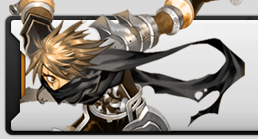
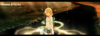
1) Not so good the render, you should have added a blur around it or something. The background doesn't really fit the image but the color is ok. And i dont like the font of the text :$ 2) Well this one is better (: The pictures are ok, but background doesn't fit, try to find a color that matches all pics. I dont like the font again lol. 3) Too plain. extremely plain. and i dont like the font. lol. So yeah, you should work more in backgrounds & text. And try to use more effects. Im not an expert but well.. ^^
|
| |
|
|
| gothica | Date: Friday, 2009-06-05, 11:06 PM | Message # 3 |
|
Level 15
Group: Fly For Hero Player
Messages: 107
Status: Offline
| lol yess boss ^.^ i mainly do sigs not for making them look totally good but to like see what things work well e.g in the first 1 i made the bg from brushes just to see if it would work oh and P.S this is like my intro to graphics work  so expect it to be bad lol so expect it to be bad lol
|
| |
|
|
| Galofigus | Date: Saturday, 2009-06-06, 6:12 AM | Message # 4 |
|
Angel
Group: Fly For Hero Player
Messages: 287
Status: Offline
| the hitsugya one was good at 1st glance, but once you actually looked at the detail the background didnt fit at all, i liked the way you blured him in tho. the rukia one would look good with a background sort of from the 1st opening on the anime, really retro with coloured squares all over the place.

|
| |
|
|
| bLooH | Date: Saturday, 2009-06-06, 7:11 AM | Message # 5 |
|
Level 5
Group: Fly For Hero Player
Messages: 58
Status: Offline
| i dont actually read/watch bleach but,
is hitsugaya that tall? o.o
rukia sig is good but
the kirby thing (3rd one) is the best
|
| |
|
|
| gothica | Date: Saturday, 2009-06-06, 5:21 PM | Message # 6 |
|
Level 15
Group: Fly For Hero Player
Messages: 107
Status: Offline
| hitsugaya is the size of "an elementory kid" (quoted from bleach itself lol) n its details to diff things not the whole sig itself lol
|
| |
|
|
| MorningBreeze | Date: Wednesday, 2009-06-10, 8:29 PM | Message # 7 |
 Level 15
Group: Blocked
Messages: 132
Status: Offline
| I love the pink one  *third one*

|
| |
|
|
| Hana | Date: Wednesday, 2009-06-10, 8:47 PM | Message # 8 |
 Head Mod
Group: Head Moderator
Messages: 374
Status: Offline
| if you're not that well versed in doing a detailed/fitting bg.
i suggest you resize your sig smaller to make it more focused on the renders and more outstanding.
IGN : Hana, Senna, Liane. HGM of FlyFH. Proud Clan Master of whatever.
|
| |
|
|
| System | Date: Wednesday, 2009-06-10, 11:13 PM | Message # 9 |
 Vagrant
Group: Fly For Hero Player
Messages: 3
Status: Offline
| My Opinion
1.) All of the renders have no frame which they should do well it depends on your style
2.) You should make it smaller because it takes alot of space.
3.) It looks too simple their all kind of the same style if you know what i mean.
Well out of those things the rest is pretty awesome good job!

System[Justin]
Message edited by System - Wednesday, 2009-06-10, 11:14 PM |
| |
|
|
| gothica | Date: Thursday, 2009-06-11, 1:08 PM | Message # 10 |
|
Level 15
Group: Fly For Hero Player
Messages: 107
Status: Offline
| every old sig of mine is 500 by 200 n i aint gna change em all O.o too much effort lol. ill b postin more when the forum decides i can get on at home xD
|
| |
|
|
| JunK | Date: Thursday, 2009-06-11, 6:45 PM | Message # 11 |
|
Angel
Group: Head Moderator
Messages: 393
Status: Offline
| KIIIIIIIIRRRRRRRRBBBBBBBYYYYYYY i don't like the font, but otherwise it looks fuckin awesome. i dunno what these guys are thinkin too plain, thats how i like it. no need to always be filled with extreme amounts of crap, then its too busy and stupid
Yakuza - Blade101
xYakuza - Strongest Merc Flyff has ever seen
|
| |
|
|
| Ailyn | Date: Thursday, 2009-06-11, 6:55 PM | Message # 12 |
|
Level 15
Group: Fly For Hero Player
Messages: 124
Status: Offline
| I dont like the font either. And yeah i dont really like plain sigs, and the color should be brighter. Its the worst sig of those 3 imo xD
|
| |
|
|
| GodHades | Date: Friday, 2009-06-12, 0:18 AM | Message # 13 |
 GOD
Group: Blocked
Messages: 402
Status: Offline
| your sigs are a bit big, but eh, not a problem really.
I like em.
They're not plain really. Most sigs now days have to much in it that you can't even tell whats going on or even, whats the theme.
Anyway, try to stay away from the color turquoise. It has a tendency to make anything look... eh.. visually displeasing. keep up the good work.

|
| |
|
|
| MorningBreeze | Date: Friday, 2009-06-12, 11:51 AM | Message # 14 |
|
Level 15
Group: Blocked
Messages: 132
Status: Offline
| Quote (GodHades) It has a tendency to make anything look... eh.. visually displeasing. keep up the good work. How long were you thinking this. *drools*
|
| |
|
|
| gothica | Date: Friday, 2009-06-12, 2:41 PM | Message # 15 |
|
Level 15
Group: Fly For Hero Player
Messages: 107
Status: Offline
| lmao look im posting my work from years ago ^.^ im much better now xD
sig update    right thats all my old stuff done
next set will be my new ones and better ones i promise
Message edited by gothica - Friday, 2009-06-12, 9:32 PM |
| |
|
|